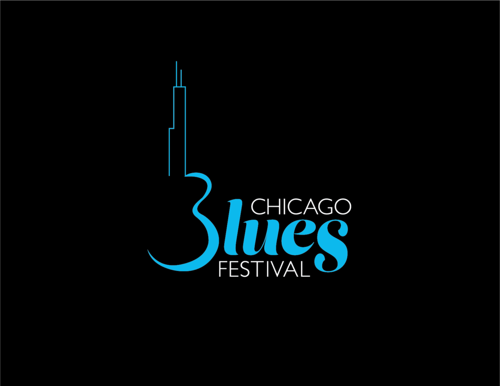
This logo encapsulates the festival’s rich history and contemporary allure. Inviting viewers to embrace the rich history of the city’s iconic music festival, the rebrand focused on familiarity and simplicity.
A moody script typeface adds a touch of emotion, complemented by a clean sans-serif font for legibility. The light blue captures the essence of the blues and hints at the Chicago flag, while black and white lend a classic vibrancy.
This project included a logo, a stationary set, a style guide booklet, environmental signage concepts, and website mockups for desktop and mobile.
